Google Redux: a design exercise
I saw this site posted on digg yesterday while on my PDA, it’s worth checking out, I think the redisgn of the Google Homepage this guy has done is pretty good!
It seems that now and perhaps into the future, all your base are belong to Google. The company has done a good job becoming the search tool of choice for the vast majority of internet users and it’s quickly becoming the name behind many useful and popular online applications and marketing tools.
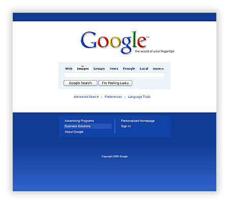
What Google does not do well is apply design appropriately to its search engine interface. Other online application interfaces from Google are often done rather well, or at least not too badly. The search engine page, however, leaves a lot to be desired. Mind you, we’re talking about the most successful search tool on the Web. But it is no stretch to observe that the design of this page is pretty bad.
So I’d like to do here pretty much what I did in pointing out and addressing eBay’s design failings. I hope to illustrate how Google could improve their search interface with just a few tweaks and have a page design worthy of their brand and its gravity. As with the eBay exercise this is a quick and dirty take on things, taking into account mostly visual and a modicum of usability issues. In any event, I suggest that these changes would result in an improved interface. As for those of you reading this, please, do try this at home. It is a fun and useful exercise.
Read the full article here.